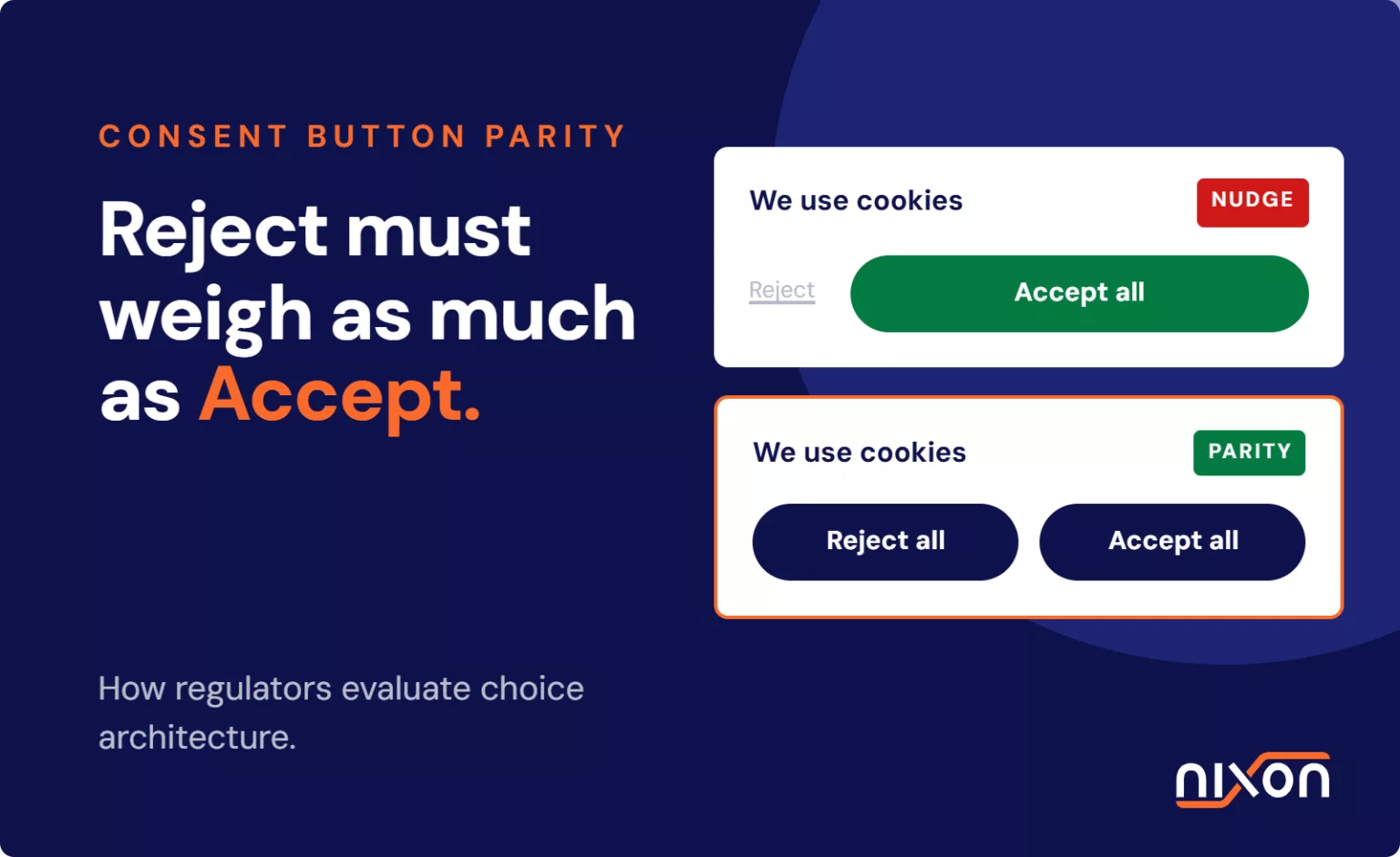
Consent banner button parity determines whether a website presents the choice to accept or reject tracking with equal visual prominence and equal operational effort. European data protection authorities no longer stop at reading your legal disclaimers. They inspect the computed CSS of your buttons. Regulators across France, Germany and the UK scrutinise visual asymmetry, such as bold Accept buttons paired with muted or hidden Reject options. In our audits of enterprise websites, button parity is where legal requirements collide with marketing templates. Ensuring strict consent banner button parity is not merely an aesthetic choice. It is the baseline requirement for valid, freely given consent under GDPR. This guide examines regulatory expectations for choice architecture, identifies common misconfigurations in enterprise CMP setups, and explains how to align front-end interface symmetry with reliable script blocking.
What regulators mean by consent banner button parity
Consent banner button parity is the legal requirement that rejecting website tracking must match accepting it in visual weight, contrast and interaction steps. Under GDPR Article 4(11), consent is invalid when interface nudges, low-contrast text or hidden secondary layers steer users toward accepting cookies.
Under Article 4(11) of the GDPR, consent must be freely given, specific, informed and unambiguous. European regulators interpret freely given strictly. Rejecting tracking must be just as easy, prominent and accessible as accepting it. If a user feels steered toward a specific choice by interface design, the legal validity of that consent evaporates. Button parity establishes that both options occupy the same visual and functional tier within the user interface.
Visual symmetry across primary actions
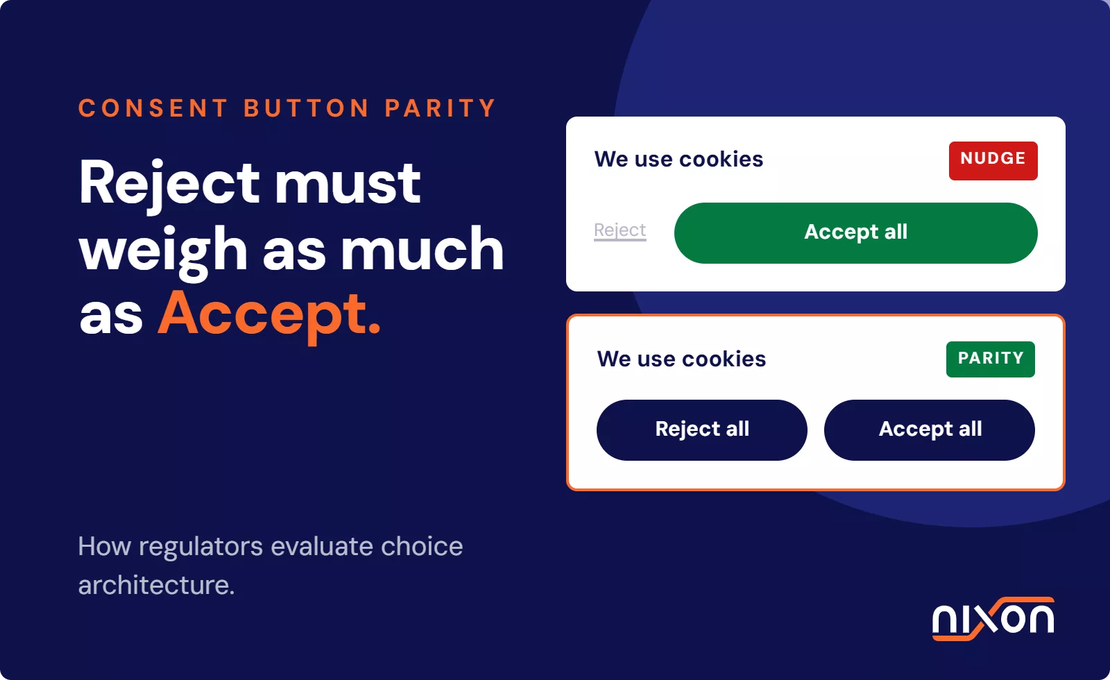
In practice, visual symmetry means your Reject All button needs the exact same container size, padding and legibility as Accept All. We routinely see design systems apply a ghost border on Reject while Accept receives a vivid corporate brand colour. To supervisory bodies, that visual asymmetry alone invalidates user consent. The official CNIL guidelines on cookies and tracking devices state that users must be able to refuse tracking with the same ease as accepting it. Presenting an Accept button styled as a bright, filled call to action while rendering Reject as plain unstyled text violates this principle directly.
Equal click depth for rejection and acceptance
Click depth is a primary factor during regulatory evaluations of consent banners. If accepting marketing cookies takes a single click on the initial layer, refusing them must also require only a single click on that same layer. Forcing users to enter a secondary preferences modal or adjust individual category toggles introduces deliberate friction. When rejection demands three clicks and acceptance demands one, authorities conclude that the website deliberately impairs free choice.
Deceptive patterns and unlawful nudging
Deceptive patterns manipulate human cognitive biases to drive tracking opt-in rates higher. For example, using a prominent primary button for acceptance and an inconspicuous link for rejection nudges visitors toward non-privacy-friendly decisions. The European Data Protection Board Cookie Banner Taskforce highlighted these asymmetric practices as unlawful steering. A compliant implementation presents neutral options that inform rather than influence user behaviour.
How DPAs audit consent banner choice architecture and button parity
Supervisory authorities have moved from issuing gentle guidance to conducting structured enforcement sweeps. Their technical teams examine both the surface presentation of consent dialogs and the network activity generated by user decisions. Regulatory decisions confirm that design choices directly impact data collection compliance.
CNIL and BfDI enforcement criteria
The French CNIL and the German federal and state regulators (BfDI and regional DPAs) have set explicit standards for interface audits. The CNIL has issued major fines against enterprises that failed to provide an equivalent Reject All button on the first layer. Meanwhile, the UK regulator maintains strict standards through the ICO guidance on cookie rules and consent mechanism design. The ICO gives publishers explicit deadlines to bring consent interfaces into symmetry. Both UK and EU regulators treat unequal button formatting as an active violation of consent standards.
Automated audits versus human manual review
Regulators deploy headless browser crawlers to capture consent banners. These automated scripts measure the bounding boxes, computed styles and colour contrast of interface elements. They calculate the contrast difference between buttons and log the number of interaction steps required to refuse tracking. Following automated sweeps, human caseworkers conduct manual reviews of high-traffic enterprise properties. They evaluate whether the overall design introduces subtle behavioural nudges that automated scripts might miss.
The gap between banner appearance and tag execution
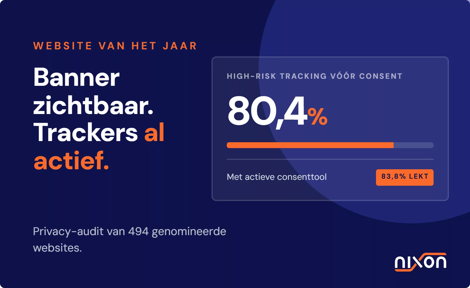
Auditing extends past visual presentation to network request monitoring. A website might display balanced buttons, yet still transmit analytical and advertising payloads before any button is clicked. Regulators check whether selecting the balanced Reject button actually prevents marketing scripts from loading. Proper interface design must tie directly into tag manager consent governance. That way, rejecting cookies reliably suppresses firing triggers in the tag management layer.
Common choice architecture failures in enterprise CMP deployments
Global web teams often deploy standard vendor templates without tweaking the CSS, unintentionally introducing friction that draws fines even on high-end CMP setups.
Contrasting colours and prominent call-to-actions
The most frequent failure involves using high-contrast corporate brand colours for the Accept button while styling the Reject button with low-contrast greys. For instance, placing a dark green button next to a light grey button on an off-white background draws the eye immediately to the affirmative option. Marketing teams want high opt-in rates, so design systems default to ghost buttons for rejection. Regulators treat that deliberate asymmetry as unlawful nudging, not an innocent styling choice.
Hiding reject options behind secondary preference layers
Many CMP deployments offer an Accept All button alongside a secondary Manage Preferences button on the first banner layer. The actual Reject All action remains buried inside the settings menu. While evaluating platforms in our structured OneTrust vs Usercentrics review helps identify capable tools, the deployment itself must be configured correctly. Regulators across the EU have repeatedly penalised websites that place the refusal mechanism one level deeper than the acceptance mechanism.
Defaulting settings prior to active user selection
Some consent implementations present category toggles that are pre-selected to active for analytics or targeting categories before the user clicks save. GDPR rules established by the CJEU in Planet49 confirm that pre-ticked boxes do not constitute valid consent. Even if buttons are visually balanced, pre-setting tracking toggles to an active state invalidates the user choice architecture completely.
Configuring OneTrust templates for compliant button parity
OneTrust can handle strict consent banner button parity out of the box, but default template presets frequently get it wrong. Configuration teams must deliberately tune visual styling and tag manager firing logic to ensure full compliance across all digital properties.
- Configure visual styling symmetry in the OneTrust admin console. Ensure that the Reject All button matches the Accept All button in padding, font family, font size and border radius. If the Accept button uses a solid background, style the Reject button with an equally legible solid fill or high-contrast border. Avoid ghost buttons or low-contrast borders for rejection. Reviewing a detailed OneTrust cookie consent setup checklist helps teams verify that every visual parameter conforms to parity rules.
- Align OneTrust button events with tag manager triggers. When a user clicks Reject All, OneTrust pushes an event to the data layer indicating refusal of non-essential categories. The tag manager container must listen for this event and update consent states immediately. If triggers are misaligned, scripts may continue executing in the background despite the user pressing reject. Teams must configure blocking triggers that halt all tracking scripts when rejection events fire.
- Audit consent persistence across subsequent page loads. Once a user interacts with the balanced consent banner, the resulting consent state must persist across the entire browsing session. Developers should inspect browser storage to confirm that the OptanonConsent cookie records category choices correctly. Subsequent page transitions should never re-trigger marketing scripts or display secondary banners asking the user to reconsider. Maintaining technical parity requires verifying that a rejection remains respected across every route, template and subdomain on your digital property.
Achieving complete consent banner button parity requires fixing CSS styling and tag triggers simultaneously so tracking scripts genuinely halt. If you need to align your multi-brand templates with European enforcement standards or audit tag execution across complex properties, learn more about our OneTrust implementation services.
Frequently Asked Questions (FAQ)
What is consent banner button parity?
Consent banner button parity is the practice of presenting both the accept and reject tracking options with equal visual prominence and equal operational effort. Under European privacy laws, a website cannot style the accept button as a prominent call to action while rendering the reject option as a subtle link or burying it inside a secondary settings menu.
Does GDPR require a Reject All button on the first layer?
Yes, major European data protection authorities, including the French CNIL and the German BfDI, require a Reject All button on the first layer of a cookie banner. If users can accept non-essential cookies with a single click, they must be given the ability to reject them with a single click on that same initial screen.
Can a cookie banner use different colours for Accept and Reject?
Regulators discourage using contrasting colour schemes that nudge users toward acceptance. While colours do not need to be completely identical, both buttons must possess equivalent visual weight and legible contrast against the background. Using a vibrant brand colour for Accept and a muted, washed-out grey for Reject violates choice architecture guidelines.
Why do regulators classify unequal button styling as a dark pattern?
Regulators classify unequal button styling as a dark pattern because it exploits cognitive shortcuts to steer visitors into surrendering privacy. When visual hierarchy makes rejecting cookies difficult or less obvious, user consent is no longer freely given, which invalidates the legal basis for processing under GDPR Article 4(11).
How does button styling affect tag manager consent firing?
Button styling directly dictates user interaction paths that generate consent signals. When buttons are visually balanced, users produce genuine choice events that tag managers interpret to either execute or suppress tracking tags. Flawed implementations often style a reject button without correctly linking its click event to tag-blocking triggers, creating non-compliant data leaks.